Usually when I hear about an upcoming demo or a beta weekend or even alpha releases, I always feel exited to hop in on the action.As someone who works in Quality Assurance, I can only say that I have a good eye for details, and can generally construct good feedback that tackles the underlying issues of a certain game. Feels like the kind of job I could get paid for (for the games, I do have a regular paying QA job), but I do it out of love for gaming and to help others succeed on release instead of flopping. Enter Tiny Hands Adventure, the latest demo I decided to participate in.
Tiny Hands Adventure is a 3D platformer game. Think about Crash Bandicoot and tha variety of levels it offers: 2D platforming, 3D south to north levels, 3D north to south chase levels, etc. The catch is that Tiny Hands has… tiny hands, which I assume is the reason he possesses different weapons. These weapons include a drill, a dino jaw claw (like the kind you get at a carnival), even some tonfas for good measure. Each weapons has its own item action which lets you interact with the level in different ways. The drill allows you to drill on certain spots, the claw lets you reach far away objects, the robotic hands let you hold on to far away places, and so on. The game offers some unique interactions, but doesn’t stray too far from the “3D stage-driven” game mold.
Before giving my impressions, I gotta say that I feel that the game has a bunch of things to improve. There were things I liked, and things I didn’t, so I will focus mostly on the areas in which the game can improve. I will try to leave the positives until the end.
Regarding a demo
Whenever you are playing early builds of a game, you gotta keep in mind that it represents a work in progress and isn’t an indicator of the final product. Several key features might be missing, and bugs will be present, but they do not represent a finished product. Such things can include textures, missing sound effects, unfinished UIs, etc. It is important to keep this in mind to differentiate legitimate issues from works in progress.
Look and feel
I will start with what probably is my harsher critic of this game: the platforming aspect feels horrible and slippery. When a game is all about platforming, you feel like tightness in each jump is mandatory. Platforms in this game, and particularly the edges, feel incredibly slippery. What I mean by this, is that the closer you are to a platforms edge, the more likely it is that you will start drifting down until you fall. “Well that’s dumb, that is what edges are for”. Yes and no, in a platforming game, you expect to be able to run all the way to the edge of a platform and then jump. You even expect a certain degree of leniency between being considered in the platform and being considered airborne. Look at this picture of Mega Man:
Part of what makes it feel strange in Tiny Hands is that his collision box seems to think of you as off the platform earlier than other games would. If you are as used to tight jumps as I am, then you will die 9/10 trying to get into the edge of the platform and jumping. The results conditions you to jump much earlier than you otherwise would, which will also result in you dying 9/10 due to not clearing the jump.
Another issue I found was with the life system, particularly about having only one hit before dying. Dying in one hit is extremely discouraging as far as progression goes. There are several games that successfully incorporate 1 hit deaths like I wanna be the Guy. This isn’t the case here, dying by definition puts you in a deficit, and there is rarely a reason to continue playing before the first checkpoint. Pretty much every early death is an instant restart, and perhaps that is what makes it so punishing. There is absolutely no incentive to keep playing that set of lives at this point. You do keep your meat and gems, but because of how early the game is, you can just get them again.
In terms of sound, I did notice that there was no audible game over fanfare and several sound effects are missing for things such as enemies, on-hit effects, and even the slight audio produced by Tiny Hands landing. I assume this is because of the early nature of the game, but I still wanted to point it out as to not forget it.
Shadows
Even though I would consider this part of the look and feel sections, I feel that shadows deserve their own mention. Shadows are not just important because of their visual effect or how much they tax your graphics settings. Shadows are among the most important nuances of platforming games, because they help you accurately discern the location of an object in a 3D space.
One thing I noticed, is that no special consideration to shadows was made. I don’t mean that the game lacks shadows, because it doesn’t. What I mean is that shadows are relative to the artistic light source of a level. This means that if the sun is casting a 45 degree light, then shadows will adapt to that. The issue arises when you do need the specific shadow of a gem to locate it in a 3D space, but the shadow appears far away thanks to the light source.
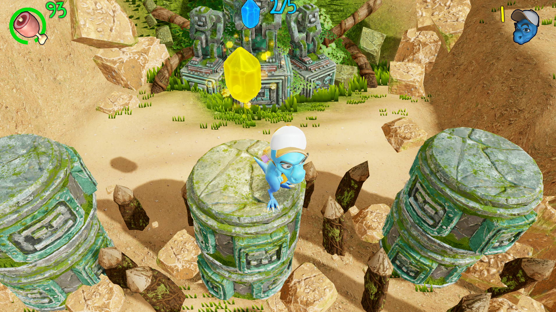
Look at the shadow of the gem from the screenshot. The light source displays the shadow far away, as any logic light source would. It does, however, doesn’t give any clue to the player regarding its position. This isn’t an issue in this case because you can safely jump withing the platform until you collect the gem, however, if that platform didn’t exist and the gem was in a chasm between 2 platforms, one of which collapses after jumping, then you would struggle to collect it.
Quality of life changes
One of the many momentum killer I’ve found was related to the weapon changes. Each time you swap weapon, Tiny Hands will stay in place and stop your movement briefly. This means you can’t change weapons on the move, or even change them in the air. Platforming games are all about momentum, and anything that increases your agility is always welcome.
Another recommendation I would add would be a weapon indicator/wheel/etc. Something that lets you know which weapon is next if you change. Anything that signals that after the drill, you are going to get the claw. It is true that you memorize the sequences over time, but that doesn’t mean you should suffer on your earlier playtime.
The Lighthouse
The lighthouse was the first level I played and it gave me a first look into what the game was going to be about. I didn’t find any issues with it initially aside from the general clumsiness of platforming, and lack of impact when doing things such as collecting crates or defeating enemies (Think about how crash bandicoot produces very loud effects when breaking crates of sending enemies flying). I did notice that on the first drill gem that it wouldn’t collect until you moved away from the gem. I can only assume the gem is collected when colliding with it, but because the drilling magically appears it in your position, then the collision event is not triggered properly. This could be easily fixed by having the gem jump in the air and then land on top of you.
The lighthouse climb section did provide some cumbersome moments. What stood out the most to me was how unreliable the lighthouse rotation felt. Every time I jumped from a platform into the next one, the lighthouse rotated and I found myself closer to the southern edge of the following platform. This is easy to understand if you consider the nature of the rotation: your jump moves you horizontally but the next platform rotates towards you, meaning you are caught by the southern edge of a platform first. What this meant in the bigger pictura, was that if you go from one platform to the next one just pressing Right, then you would eventually fall to your doom. You had to be jumping with an up-right direction as to not fall. This feels inconsistent with other games that offer rotation.
I did also felt that there needed to be more to the lighthouse climb. It just is jumping from progressively tighter platforms, after a couple of them it felt dull.
Aztec Jungle
I’ll admit the beginning section of this game confused me a lot. It took me a minute to realize that I had to go downwards. Which brings me to another thing I’ve noticed: the level boundaries are poorly marked in most places.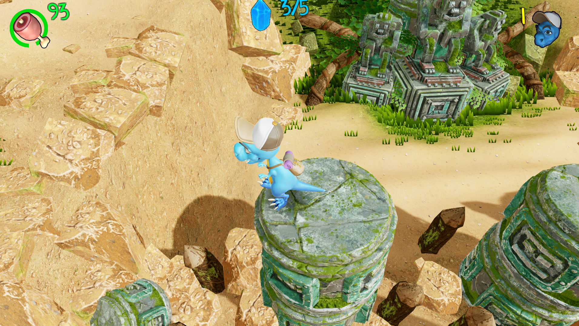
While going through this chasm on my first play through, I didn’t know if I should jump to the left, to the north or to the south. Gaming logic told me to keep jumping, but the other side felt quite far and instead I opted to go south, as the level had previously conditioned me to do. I died. Turns out, I did have to keep jumping left.
This level took me the most time to clear because of two things, one of which is how little you can see on the chase sections. It is always tricky to proceed south, because the viewport is always naturally tilted to the north which offers a lot of visibility of upcoming dangers. When going south, however, there is very little time to react to the dangers.
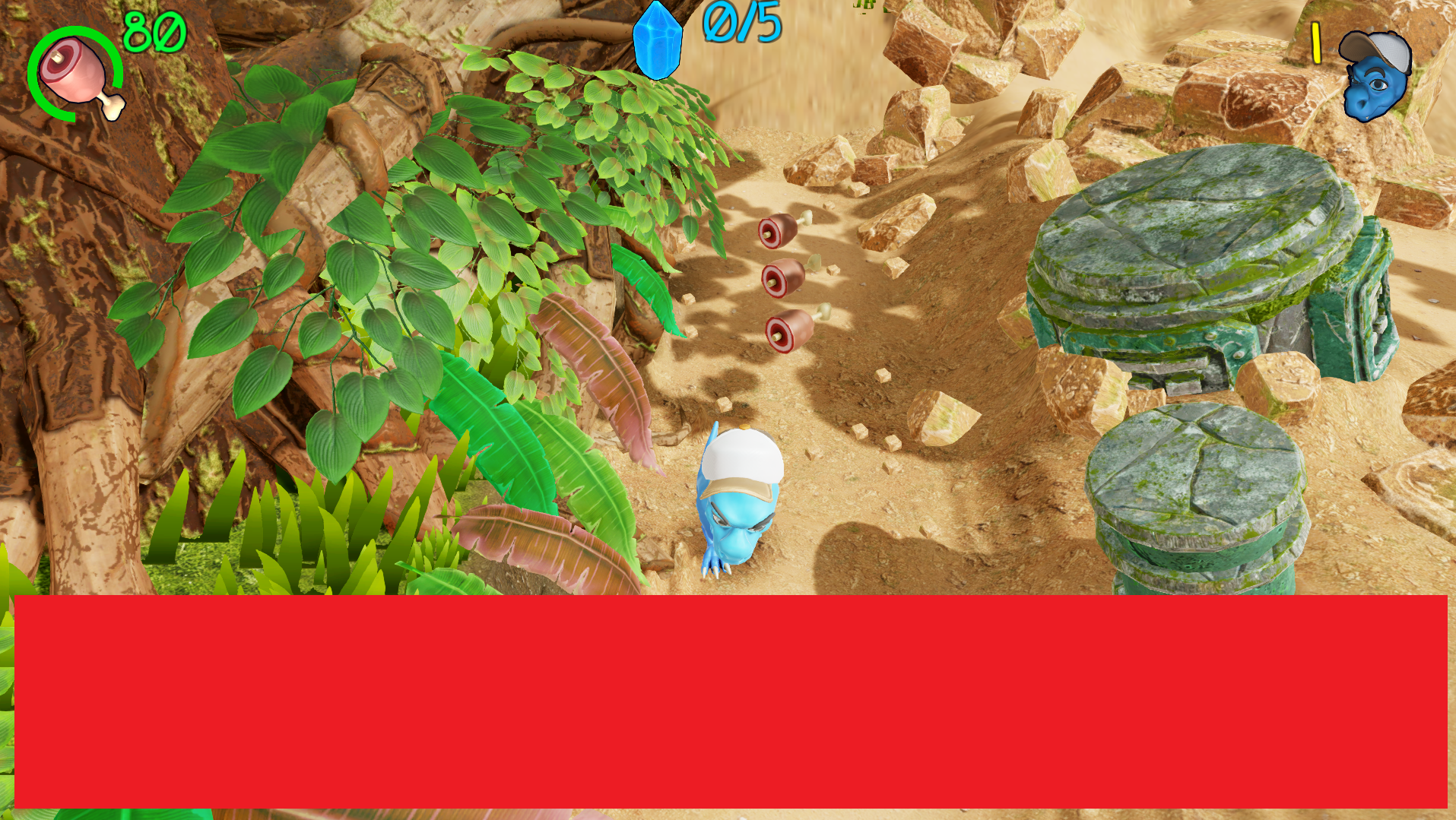
Just look at the huge ass red rectangle. This rectangle represents your vision of upcoming dangers. The vision, coupled with your move speed, indicates how little time you actually have to react to dangers. The time is very low, and often feels cheap to be killed by an upcoming pit. I wouldn’t be doing a good job if I only pointed out flaws without offering solutions, so for that lets just take a look at how Crash bandicoot manages chases:
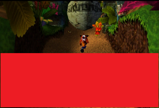
See how much bigger the rectangle is? Not only that, the camera is tilted more towards Crash, which offers an even broader picture of upcoming pits.
For the most part, I felt the pit deaths were cheap. I was able to clear it by memorizing their position. I do not think there is something wrong with memorization games, Battletoads for the NES is a game that incorporates it very well. The difference is that when first meeting a hazard, you feel like you at least had a fighting chance instead of being instantly killed. The Turbo tunnel and Ducky tubes are good examples of that.
Another thing I want to point out is how some platform disappear from your vision some times.
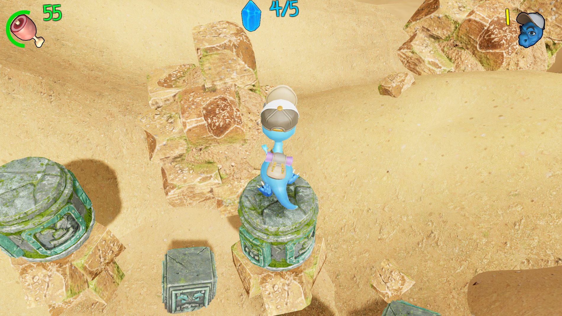
There was a set of 4 pillars that led to a gem. In the screenshot I already collected the gem, which was on the left pillar. I didn’t have a way to see the other 2 pillars I jumped from, since those 2 were on the south and I could no longer see that far away. The next pillar was to the southeast, so jumping back isn’t particularly easy.
Stairway to Heaven
This level was actually my favorite of the bunch. There are a lot of problems mentioned before present in this level, like the lack of accuracy from shadows, but other than that it offered a nice view from the level and the aesthetic was quite pleasing.
I won’t just give it a free pass though. For some reason I felt the shadows issue much more when trying to locate myself in the 3D space.
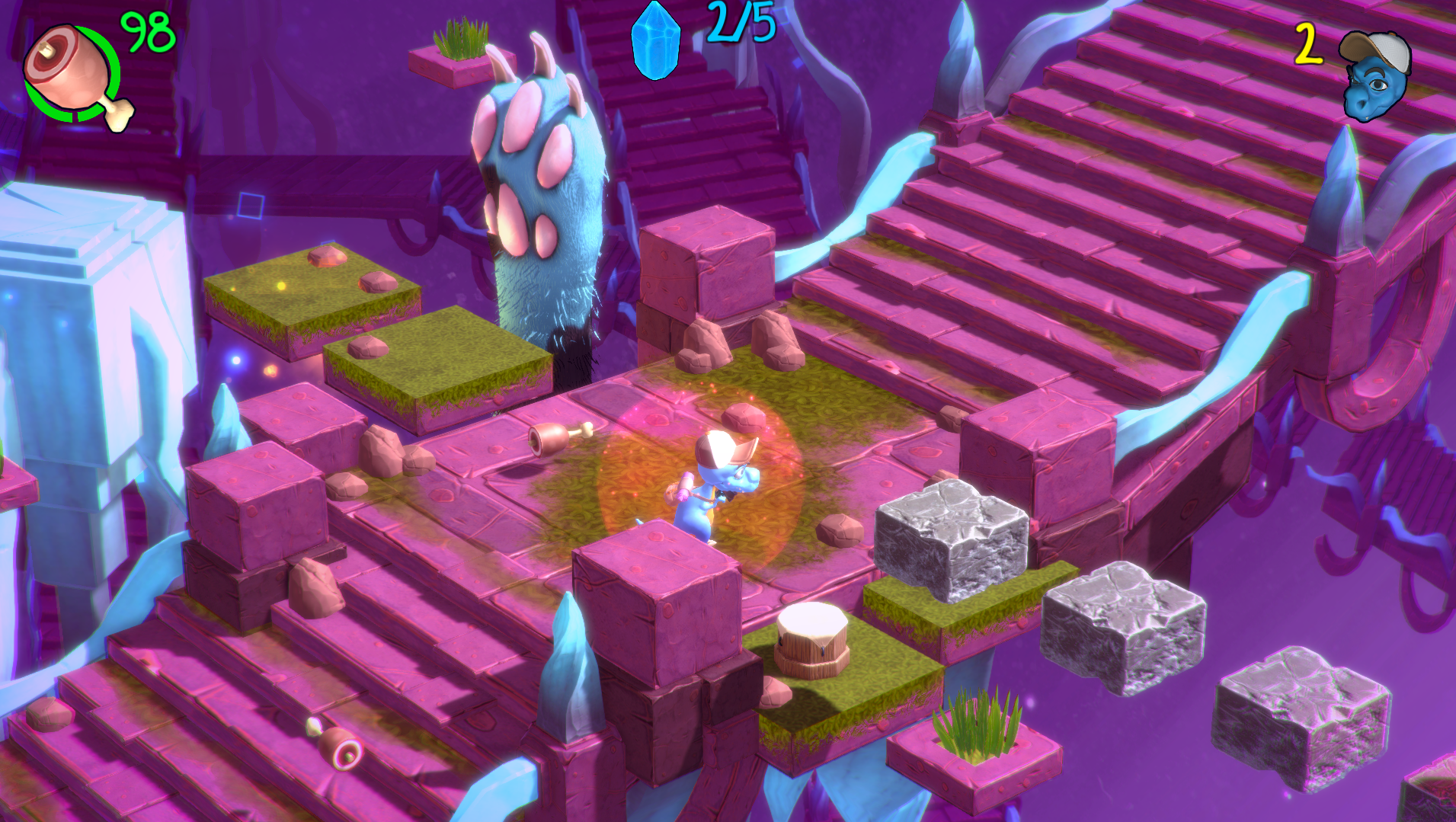
I had 2 big issues in that screenshot.
The first issue was that I couldn’t quite tell if the cat paw was supposed to be between the 2 green platforms of just on the first one. Shadows didn’t help either, so I just did the reasonable thing and used the gap between attacks to clear the platform and the gap in one go.
The second came from the rock platforms to the right. The angle made me think they were over the green platform to the right. Then I discovered that the wooden thing was a trampoline and that the rock platforms were inline with it, just higher. It seems obvious in hindsight, but it will inevitably kill you on your first go, which always leaves a cheap taste in the mouth.
At one point I was also blocked by this annoying huge thing:
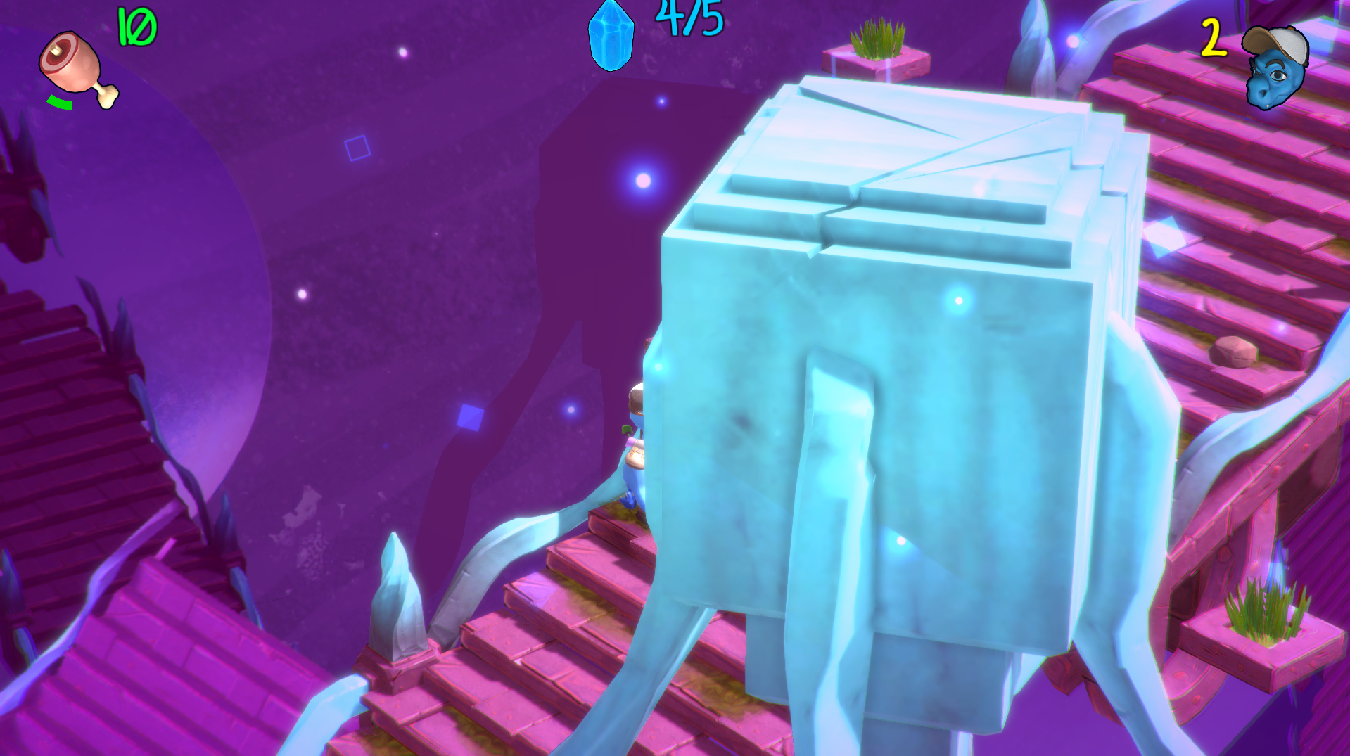
I’m not sure if this was intentional. I do hope it wasn’t, blindness are a hazard is pretty awful from a gameplay perspective.
I was also randomly killed by meteors on occasions. It felt annoying since they came out of the sky, if only there had been a shadow I could see….
Snow level
I forgot the name of the slow level. I liked the platforming here! Unlike the lighthouse, it felt fun and meaningful. There was also the inverse of the chase section with a vertically advancing to the north section. Having a wide viewport makes all the difference in the world.
I also encountered this funny bug when using the hooks for the first time:
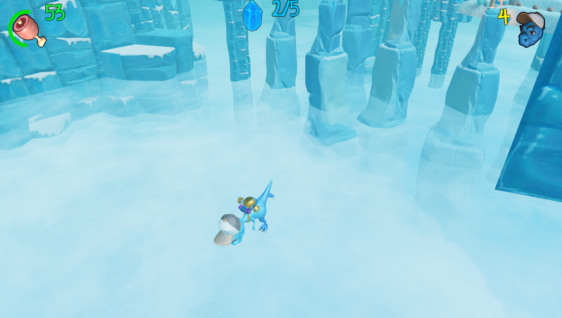
I was standing on the hook platform facing the southwest when I pressed the action button. I never died or went out of bounds, so I had to restart.
Other than that the level was pretty good. I did encounter the already mentioned details like the sloppy platforming.
The Guardian
This fight felt extremely weird for some reason. The fight isn’t hard at all, but I was extremely cautious when attacking him. At this point I was more or less conditioned by the game to dying because of unfair hitboxes, so I always took my sweet time jabbing at a distance to the enemy.
I did encounter a bug where after a hit to the boss, he knocked me away from the platform and sent me out of bounds without a way to make it back.
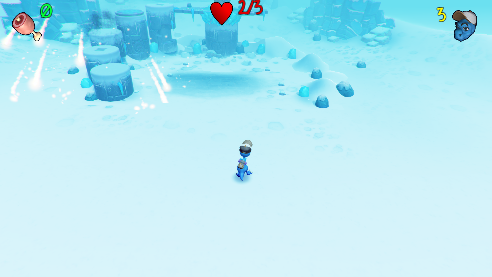
I also felt the TNT crates needed more dynamic shadows. I know I’ve rambled enough already about shadows, the difference is that the platforms do show a nice shadow when a crate is about to fall. My only gripe is that the shadow doesn’t change with proximity to the crate. It would be nice to have the shadow start out smaller and gradually increase as it approaches the ground. That makes it more visually pleasing, as well as giving the player feedback on which platform to avoid.
Closing words
Overall I gotta say this demo was pretty much a roller coaster. The visuals seem to be for the most part a finished product, and the levels and background are beautiful. They do suffer from issues like how poorly the level bounds are delimited, but other than that I imagine that they are closed to a finish product as they get. I also think the game needs something in terms of agility and speed play. Small things like being able to switch weapons mid-air, being able to combine techniques like rolling and jump, among other things, will probably help the game for the better.
If I am being perfectly honest, the sloppy platforming was a major turn-off for me at the beginning. When I say major, I mean it in a not-playing-anymore kind of way. I really hope it becomes tighter, because it otherwise creates a long lasting impression.

